Windows Greek fonts
First published on: 2021-03-10.
Author: Nuncubi.
It is often felt to be a mystery what fonts are safe to use for Ancient Greek on Windows. Here I will examine default fonts plus a few commonly-mentioned ones that can be downloaded. I would like to send my thanks to Babelstone for their useful software to examine Unicode fonts.
Windows default fonts
For this section, I examined a Windows 7 computer. Mind you Windows 7 is already past official support at the time of writing, but it is in common use and gives a good idea of what is appropriate to use.
First things first. Here are all the default Windows 7 fonts that support Ancient Greek:
- Arial
- Calibri
- Cambria
- Cambria Math
- Consolas
- Courier New
- Gabriola
- Microsoft Sans Serif
- Palatino Linotype
- Segoe UI
- Tahoma
- Times New Roman
Let's now go through them one by one.
Arial
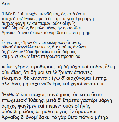
Simple and straightforward—much like Arial’s Latin.
Calibri
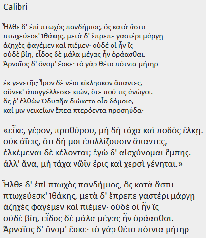
Beautiful while also simple and informal—again, much like Calibri’s Latin.
Cambria
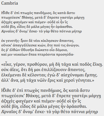
A nice serif font, although do notice the problem in rendering the composite Ἦ.
Cambria Math
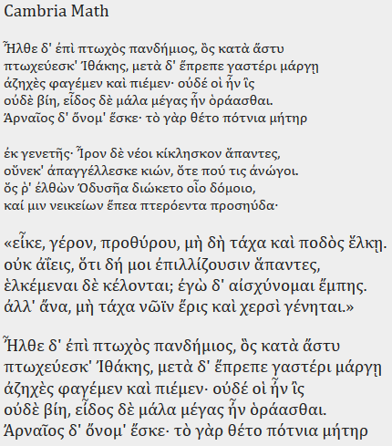
Similar to Cambria, but without the previously-mentioned problem!
Consolas
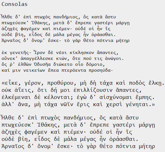
I’m surprised to see this monospace font actually covers Ancient Greek...
Courier New
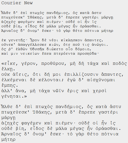
Let alone Courier New...
Gabriola
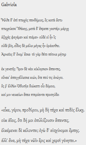
Like many “cursive” (or handwriting) fonts, this one has glyphs of a
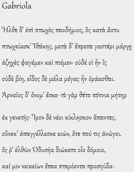
Although it looks much better at this size, it still looks rather strange in my view... I am no Greek font nerd, however.
Microsoft Sans Serif
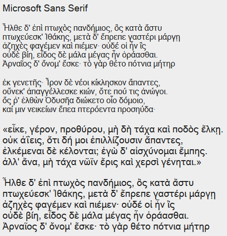
This looks quite crowded, while also rather nice. It is basically the font that Windows tends to display by default in its interfaces. It might remind you of the log-in screen...
Palatino Linotype
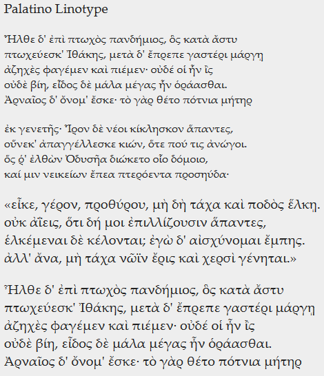
Another font rather resembling handwriting. It looks quite nice after you slightly increase its size.
Segoe UI
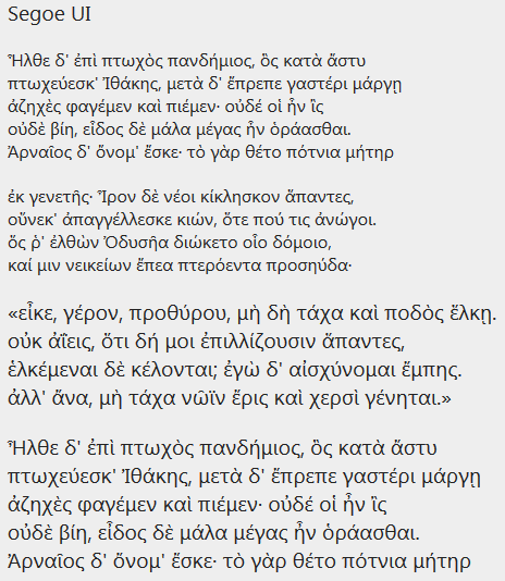
This font has a tall x-height, or height of the main height of lowercase glyphs, interestingly compensated with rather small accents.
Tahoma
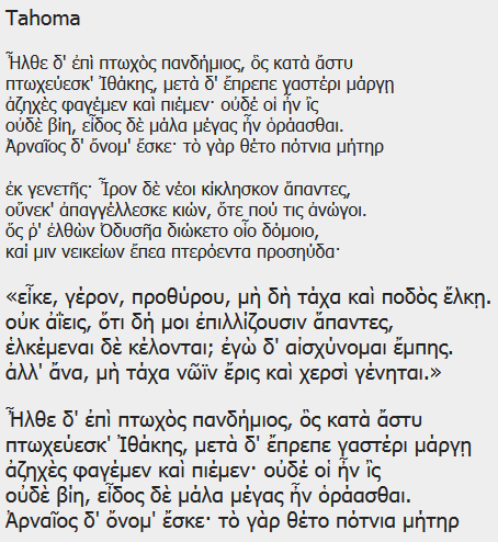
A fairly crowded font.
Times New Roman
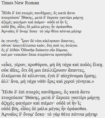
And here’s the default font we all have known to... accept.
Downloadable fonts
The following fonts do not come with Windows by default, but are worth checking out or at least mentioning. The fonts I include in this page are:
- EB Garamond
- Gentium Plus
- Galatia SIL
- Noto Sans
- Noto Serif
- Arial Unicode MS
- Carlito
- Source Sans Pro
- DejaVu Sans
- DejaVu Serif
- DejaVu Sans Mono
EB Garamond
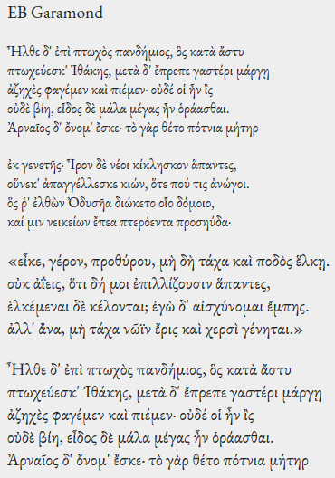
Georg Duffner’s EB Garamond is a wonderful free font for both the Latin and Greek alphabets. You can download it from here (via the “Download family” button near the top right). It looks great after increasing the size a bit:
Gentium Plus
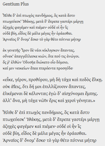
Developed by the Summer Institute of Linguistics (SIL), a Christian organization, this font is intended to be an available professional choice for users of Latin, Greek and Cyrillic. Download it from here. Do note the similarly-named (and similar-looking) “Gentium Basic” font only covers the Latin alphabet, although in more styles.
Galatia SIL
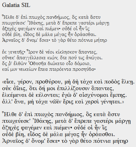
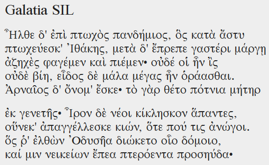
A font that the Summer Institute of Linguistics says was specifically designed to support polytonic Greek. Download it from here. Like some fonts intended mostly for printing rather than computer display, it looks unfortunately a bit too small by default. Here is the font at an even larger size:
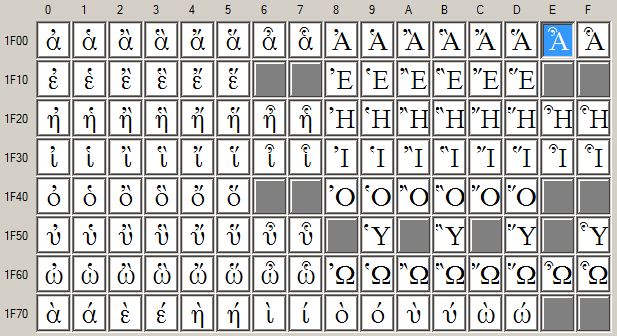
I have to say its choices of weight are quite odd. The strangely bolded capital omicron in the middle is indeed intentional, as seen in this Babelmap screenshot:
Noto fonts
Google’s Noto fonts were created to provide decent coverage of the Unicode basic plane and more (the name comes from “no tofu”, referring to missing Unicode characters in one’s computer as “tofu”, shown as rectangles). You can download them from here. There are many depending on the script, but let’s go through the two relevant ones for us.
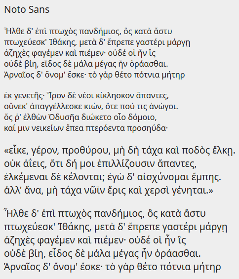
First, Noto Sans:
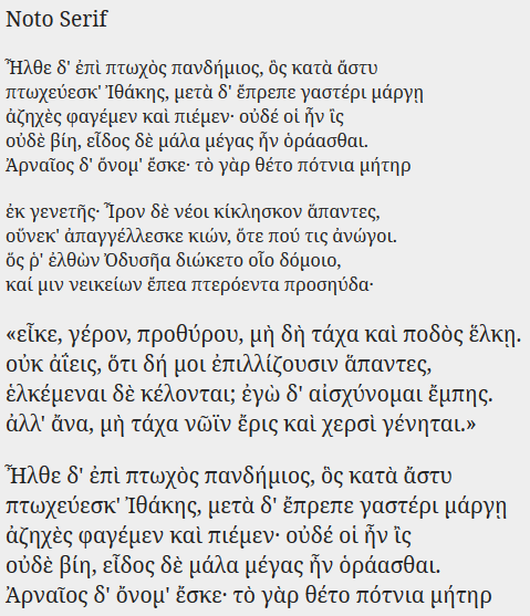
The accents look surprisingly quite small... And then, Noto Serif, a bit better in the accent department:
Arial Unicode MS
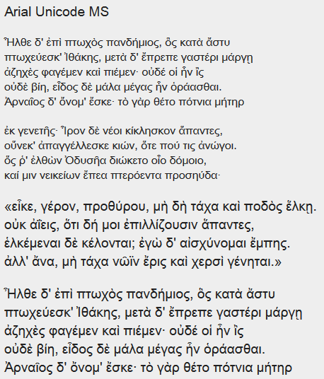
A font that used to be shipped with older versions of Microsoft Office. Although Microsoft has now abandoned supporting this font, work on it appears to continue from Monotype. It appears the company currently licenses it out commercially for US$189, although the Download Free Fonts website seems to have it too, probably for non-commercial use(?).
Carlito
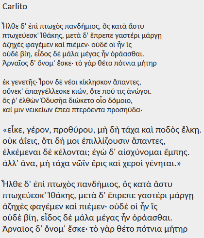
A font shipped with the LibreOffice suite.
Source Sans Pro
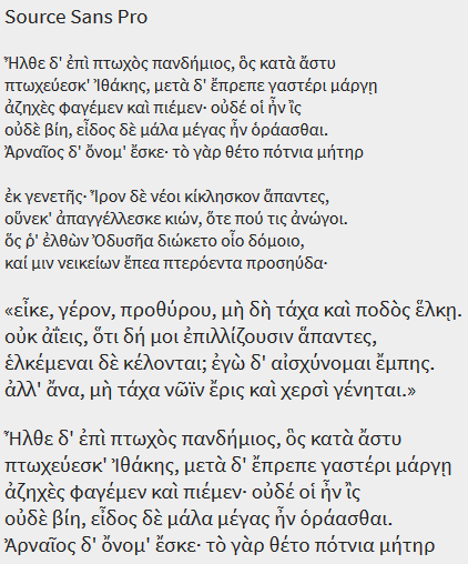
It appears this font was installed in this computer via Adobe Acroba Reader. It looks particularly readable.
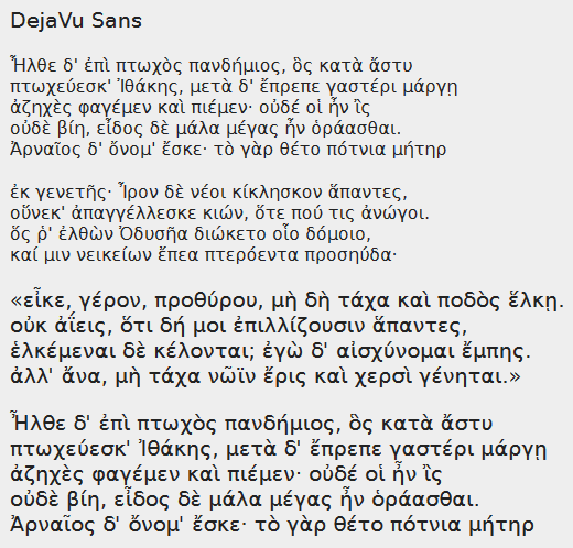
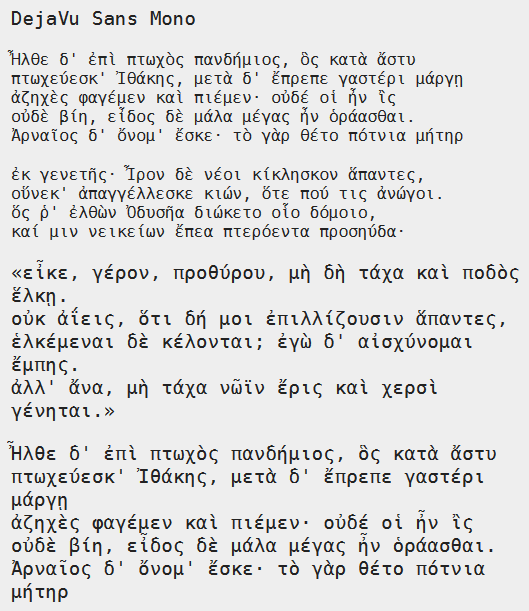
DejaVu fonts
Like the Noto fonts, the DejaVu fonts were a project to provide better Unicode coverage. They’re well known for being very wide, perhaps too wide, although good-looking for what they are. Download them from here. The project appears to be abandoned since mid-2016. Here is the DejaVu Sans font:
Then, the DejaVu Serif font:

And finally, the monospace font DejaVu Sans Mono:
Hope this has been helpful. What fonts will you use next time?